Visualizer
Introduction 
The team developed a RSM visualizer tool to allow user to summarize and compare metrics from multiple RSM model runs. It is a dashboard style tool built using SimWrapper (an open source web-based data visualization tool for building disaggregate transportation simulations) and also leverages SANDAG’s Data Pipeline Tool. SimWrapper software works by creating a mini file server to host reduced data summaries of travel model. The dashboard is created via YAML files, which can be customized to automate interactive report summaries, such as charts, summary tables, and spatial maps.
Design 
Visualizer has three main components:
- Data Pipeline
- Post Processing
- SimWrapper Dashboard
Data Pipeline 
SANDAG Data Pipeline Tool aims to aid in the process of building data pipelines that ingest, transform, and summarize data by taking advantage of the parameterization of data pipelines. Rather than coding from scratch, configure a few files and the tool will figure out the rest. Using pipeline helps to get the desired model summaries in a csv format. See here to learn how the tool works. Note that RSM visualizer currently supports a fixed set of summaries from the model and additional summaries can be easily incorporated into the pipeline by modifying the settings, processor and expression files.
Post Processing 
Next, there is a post-processing script to perform all the data manipulations which are done outside of the data pipeline tool to prepare the data in the format required by SimWrapper. Similar to data pipeline, user can also modify this post-processing script to add any new summaries in order to bring them into the SimWrapper dashboard in order to use them in Simwrapper.
SimWrapper 
Lastly, the created summary files are consumed by SimWrapper to generate dashboard. SimWrapper is a web platform that can display either individual full-page data visualizations, or collections of visualizations in “dashboard” format. It expects your simulation outputs to just be local files on your filesystem somewhere; there is no need to upload the summary files to centralized database or cloud server to create the dashboard.
For setting up the visualization in SimWrapper, configuration files (in YAML format) are created that provide all the config details to get it up and running, such as which data to load, how to lay out the dashboard, what type of chart to create etc. Refer to SimWrapper documentation here to get more familiar with it.
Setup 
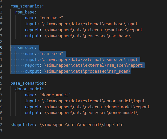
The visualizer is currently deployed to compare 3 scenario runs at once. Running data pipeline and post-processing for each of those scenario is controlled thorugh the process_scenarios python script and configuration for scenarios are specified using the scenarios.yaml file. User will need to modify this yaml file to specify the scenarios they would like to compare using visualizer. There are two categories of scenarios to be specified - RSM and ABM (Donor Model) runs. For each of the scenario run, specify the directory of input and report folders in this configuration file. Files from input and report folder for the scenarios are then used in the data pipeline tool and post-processing step to create summaries in the processed folder of SimWrapper directory. Note that additional number of scenarios can be compared by extending the configuration in this file yaml file.
Visualization 
Currently there are five default visualization summaries in the visualizer:
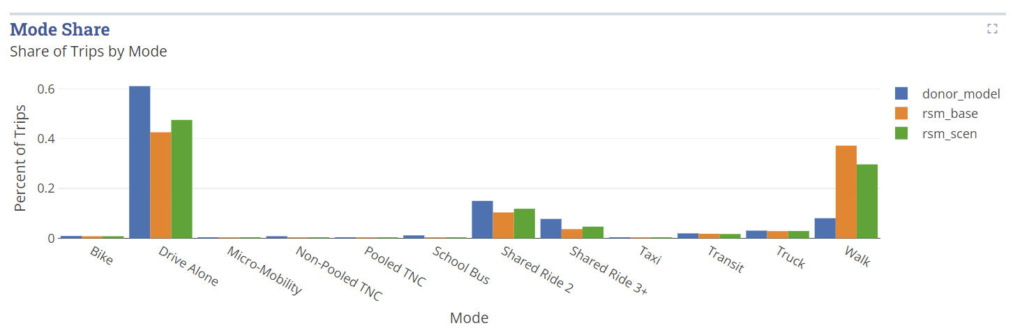
Bar Charts 
These charts are for comparing VMT, mode shares, transit boardings and trip purpose by time-of-day distribution. Here is a snapshot of sample YAML configuration file for bar chart:
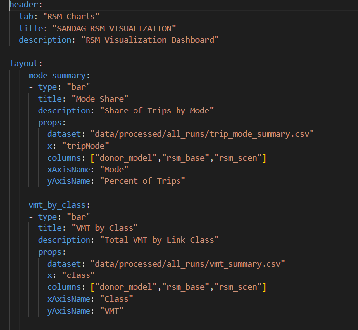
User can add as many charts as you want to the layout. For each chart, you should specify a csv file for the summaries and columns should match the csv file column name. There are also other specifications for the bar charts which you learn more about here.
Here is how the how the visual looks in the dashboard:
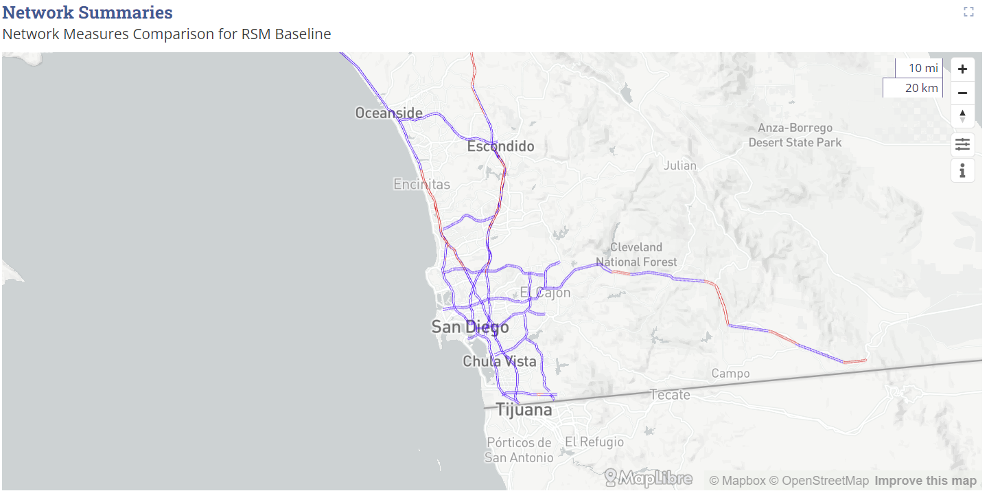
Network Flows 
These charts are for comparing flows and VMT on the network. You can compare any two scenarios on one network. Here is a snapshot of the configuration file:
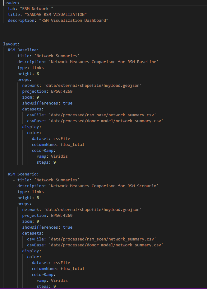
For each network you need the csv files for two scenario summaries and an underlying network file which should be in geojson format. The supporting script creates the geojson files from the model outputs for the SimWrapper. For more info on network visualization specification see here.
Here is how the how the visual looks in the dashboard:
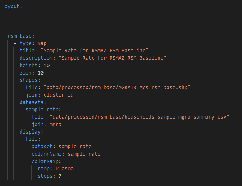
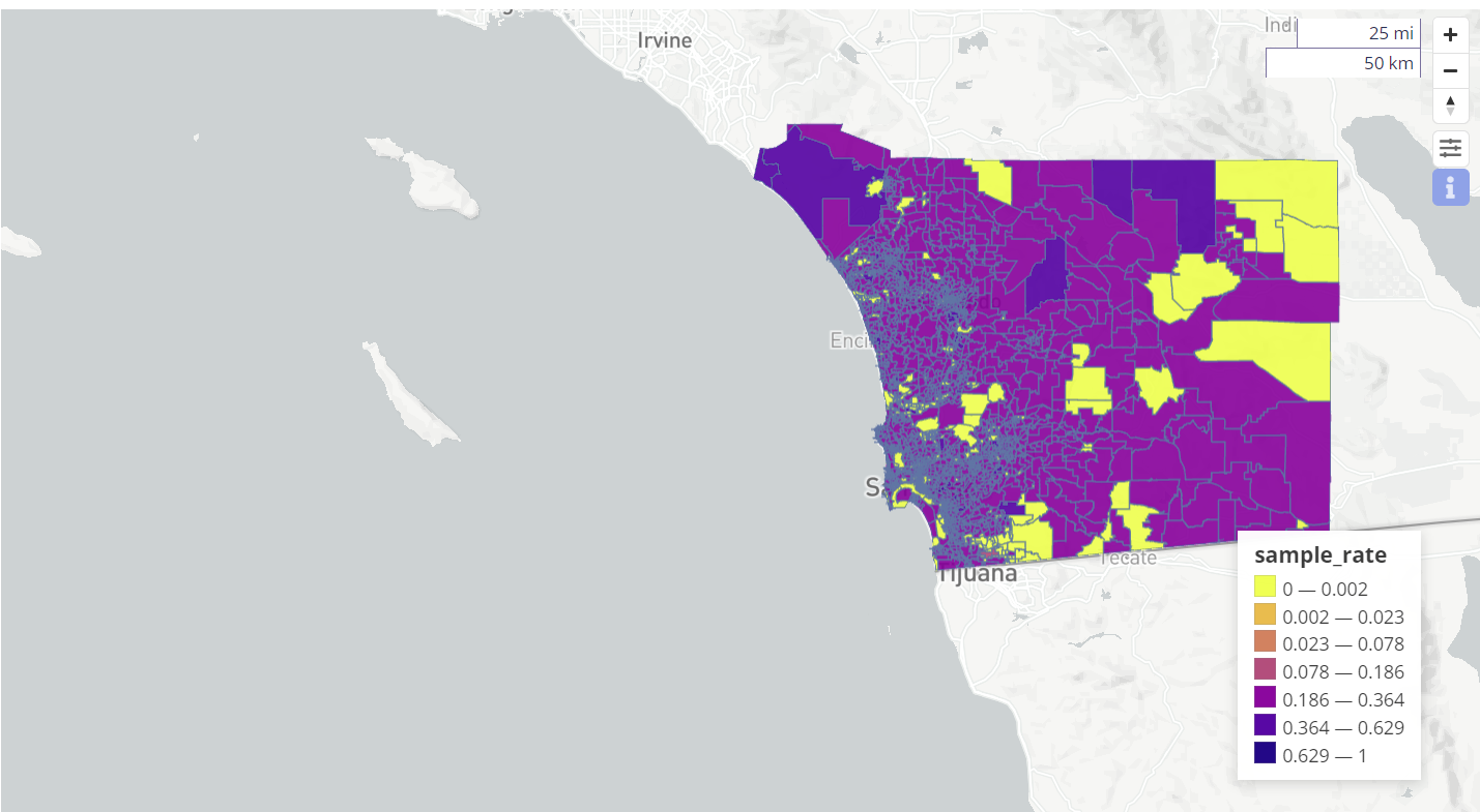
Sample Rate Map 
This visual is a map for showing the RSM sample rates for each zone. Here is a snapshot of the configuration [file]:
For each map you need a csv file of sample rates and the map of zones in .shp format. For more info on network visualization specification see here.
Here is how the how the visual looks in the dashboard:
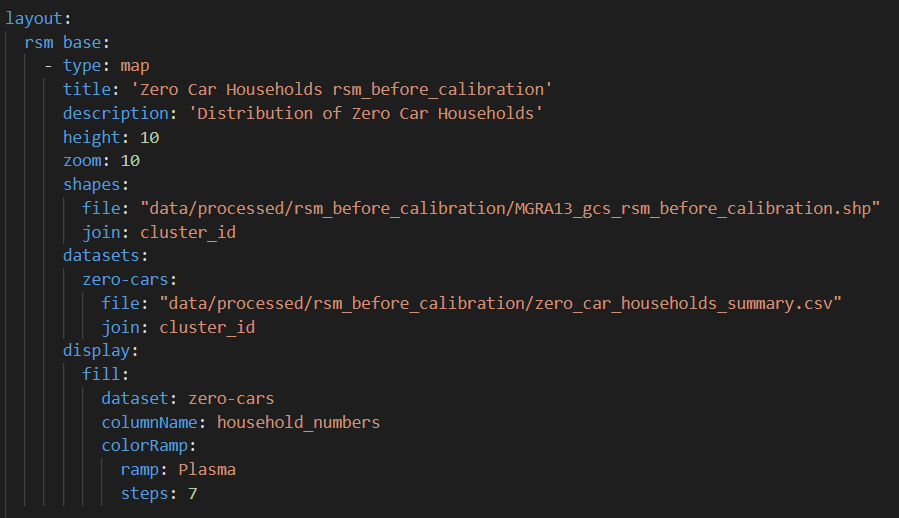
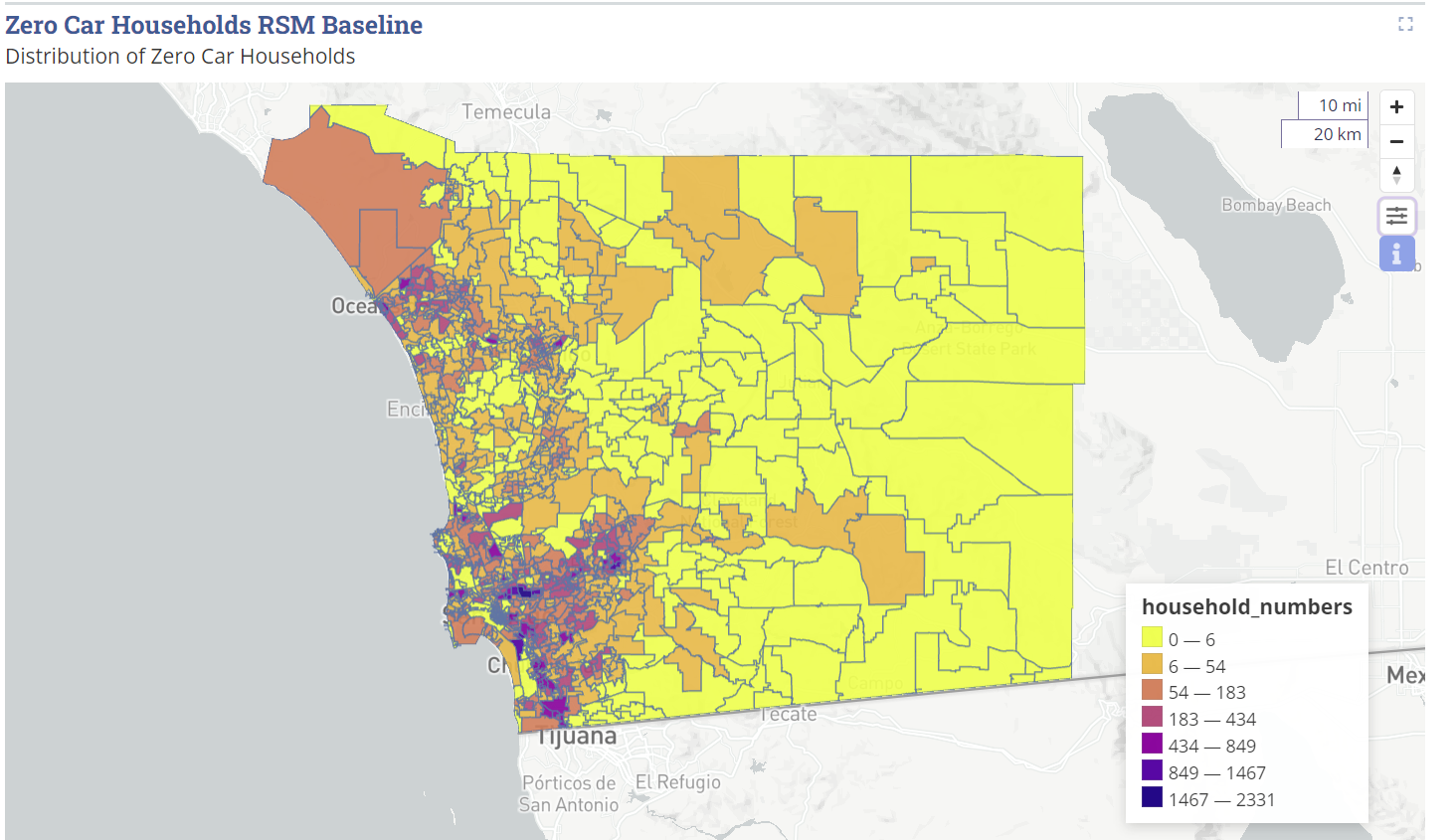
Zero Car Map 
This visual is a map for showing the zero-car household distribution. Here is a snapshot of the configuration file:
For each map you need a csv file of household rates and the map of zones in .shp format. For more info on network visualization specification see here
Here is how the how the visual looks in the dashboard:
OD Flows 
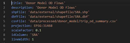
This chart is for showing OD trip flows. Here is a snapshot of the configuration file:
For each map you need a csv file of od trip flows and the map of zones in .shp format. For more info on network visualization specification see here
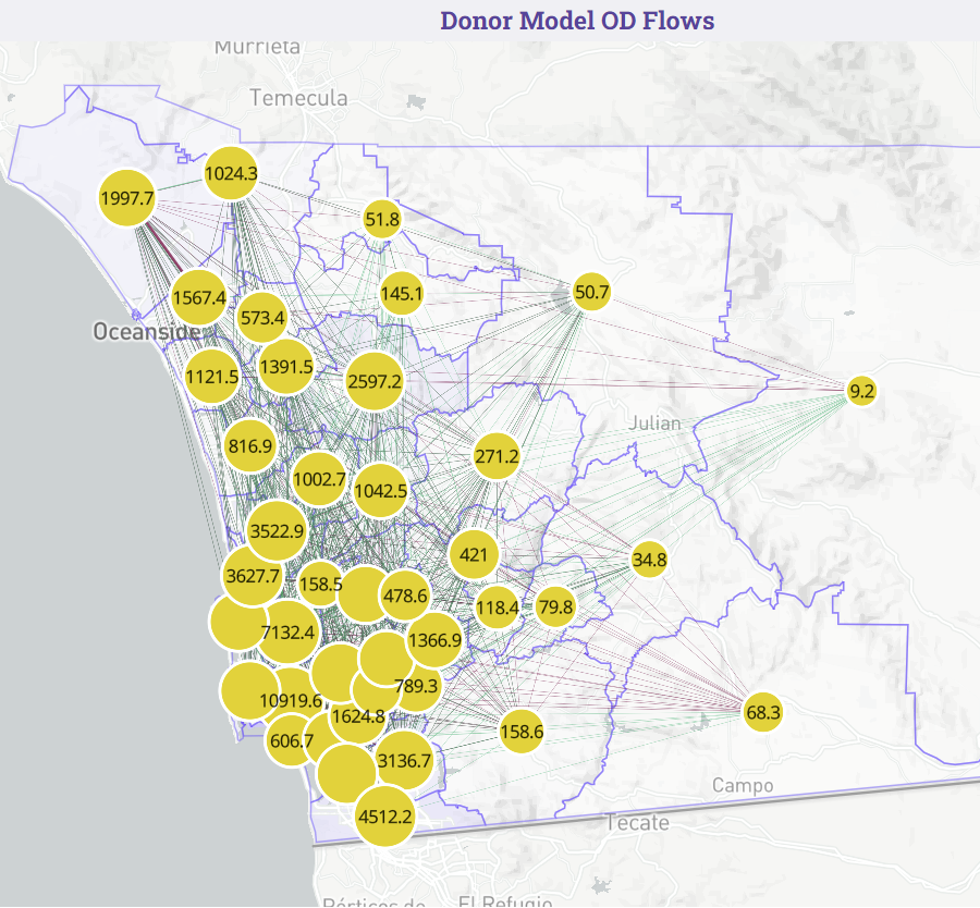
Here is how the how the visual looks in the dashboard:
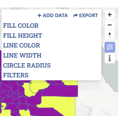
You can also modify the data and configuration of each visual on SimWrapper server. For each visual, there is a configuration button (see below), where you can add data, and modify all the map configurations. You can also export these configurations into a YAML file so you can use it in future.
How to Run 
The first step to run the visualizer is to bring in the scenario files. Currently the visualizer is setup to compare three scenarios: donor_ model, rsm_base and rsm_scen. donor_model is the ABM run, rsm_base is the baseline (no-action) RSM run and rsm_scen is the project (action) RSM run.
-
For each of the three scenarios, copy report folder from their respective scenario run to “visualizer/simwrapper/data/external/[scenario_name]/reports” folder. For instance, for donor_model copy the report folder here.
-
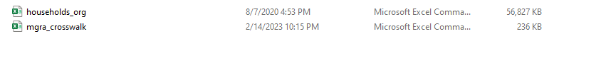
Only for the RSM scenarios, copy mgra_crosswalk.csv and households.csv files from the scenario input folder and bring them to the input folder “visualizer/simwrapper/data/external/[scenario_name]/input”. Next, change the name of the “households.csv” to “households_orig.csv”. At this point the input folder for RSM scenarios in the simwrapper folder should look like below:
As mentioned earlier, if you wish to add any more RSM scenarios for comaprison, you can do it by modifying the scenarios.yaml file. Simply add the scenario configuration by copying the rsm_scen section and paste it under and change “rsm_scen” to that new scenario name. Note that you will also need to add that another scenario config to the Data Pipeline and Post-Processing step.
Once you have copied required scenario files and the configuration setup, you are ready to runt the visualizer.
-
Open Anaconda prompt and change the directory to visualizer folder in your local RSM repository.
-
Run the process scenario script by typing command below and then press enter.
python process_scenarios.py -
Processing all the scenario using pipeline will take some time.
-
Once this script is run successfully, it creates the summary files for each scenario to feed into simwrapper.
-
Finally, open this link in the web browser - https://simwrapper.github.io/site/
-
Click on ‘Enter Site’ button, then click on ‘add local folder’ and add simwrapper directory (visualizer\simwrapper) to run the SimWrapper Visualizer for RSM.